Understanding Color Theory in Design
Color theory is a fundamental aspect of design that influences how we perceive and interact with visual elements. The choices designers make regarding color can evoke emotions, convey messages, and shape the overall aesthetic of a project. In this article, we will explore the principles of color theory and how color choices impact perception in design.
The Basics of Color Theory
Color theory encompasses the guidelines and principles used to create harmonious color combinations. It is divided into three main components:
- Color Wheel: A circular diagram that represents the relationships between colors.
- Color Harmony: The aesthetically pleasing arrangement of colors that creates a sense of balance.
- Color Context: How colors interact with each other and the effects of surrounding colors.
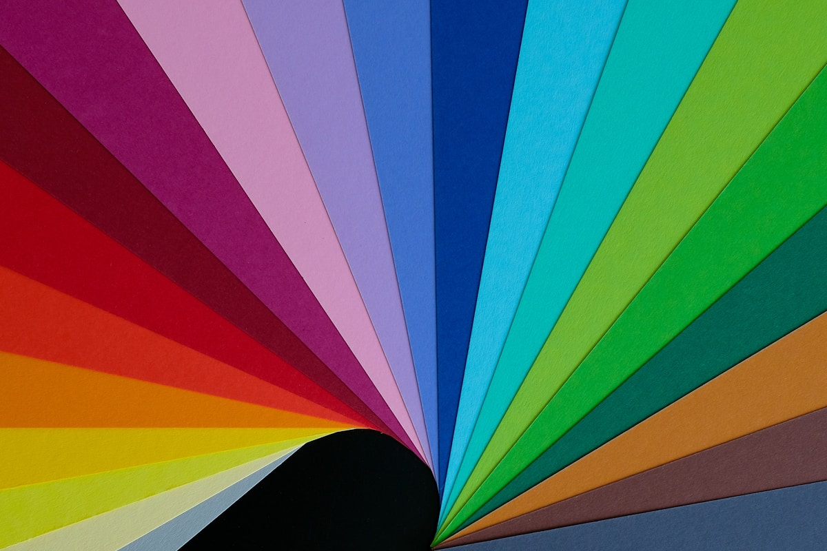
The Color Wheel
The color wheel is a crucial tool in understanding color relationships. It is typically divided into primary, secondary, and tertiary colors:
- Primary Colors: Red, blue, and yellow. These colors cannot be created by mixing other colors.
- Secondary Colors: Green, orange, and purple. These are formed by mixing primary colors.
- Tertiary Colors: Created by mixing a primary color with a secondary color (e.g., red-orange).
Color Harmony
Color harmony is essential for creating visually appealing designs. Here are some common color harmony schemes:
- Complementary: Colors opposite each other on the color wheel (e.g., blue and orange).
- Analogous: Colors that are next to each other on the wheel (e.g., blue, blue-green, and green).
- Triadic: Three colors evenly spaced around the wheel (e.g., red, yellow, and blue).
- Monochromatic: Variations of a single color, including shades and tints.
Psychology of Color
Colors have psychological effects that can influence emotions and behaviors. Here’s a breakdown of how different colors can convey specific messages:
- Red: Passion, energy, urgency. Often used to grab attention.
- Blue: Trust, calmness, professionalism. Common in corporate branding.
- Green: Nature, growth, health. Frequently associated with eco-friendly products.
- Yellow: Happiness, optimism, caution. Can stimulate mental activity.
- Purple: Luxury, creativity, wisdom. Often used in beauty and high-end products.
- Black: Elegance, power, sophistication. Used in luxury branding.
- White: Purity, simplicity, cleanliness. Common in minimalist designs.
Cultural Significance of Colors
Colors can also have different meanings across cultures. It’s essential for designers to consider cultural context when choosing colors:
- Red: In Western cultures, it often symbolizes love, but in some Asian cultures, it represents good fortune.
- Black: While it signifies elegance in some cultures, it can represent mourning in others.
- White: Associated with purity in the West, but can symbolize death in some Eastern cultures.
Color in Branding and Marketing
Color plays a pivotal role in branding and marketing strategies. Here’s how color can affect consumer perception:
- Brand Recognition: Consistent use of color can enhance brand recognition by up to 80%.
- Emotional Connection: Colors can evoke emotions that align with brand values, fostering a deeper connection with consumers.
- Call to Action: Bright colors like orange and green can encourage action, making them effective for buttons and links.
Case Studies: Successful Use of Color in Branding
Here are a few examples of brands that have effectively utilized color:
- Coca-Cola: The vibrant red evokes excitement and energy, making it instantly recognizable.
- Facebook: The blue color conveys trust and reliability, aligning with its mission of connecting people.
- Starbucks: The green color reflects growth and sustainability, appealing to eco-conscious consumers.
Conclusion
Understanding color theory is essential for any designer looking to create impactful designs. By considering the psychological effects, cultural significance, and branding implications of color, designers can make informed choices that resonate with their audience. Whether you are designing a logo, a website, or a marketing campaign, the right color choices can enhance your message and elevate your design.
As you embark on your design journey, remember that color is not just a visual element; it is a powerful tool that can shape perceptions and influence emotions. Use it wisely!