The Importance of Color in Design
Color is one of the most powerful tools in a designer’s toolkit. It can evoke emotions, influence perceptions, and even drive consumer behavior. Understanding color psychology is essential for creating effective design projects that resonate with your audience. In this article, we will explore the significance of color in design and how to harness its power.
Understanding Color Psychology
Color psychology is the study of how colors affect human behavior and emotions. Different colors can evoke different feelings and reactions, making them a vital element in design. Here are some key aspects of color psychology:
Emotional Impact of Colors
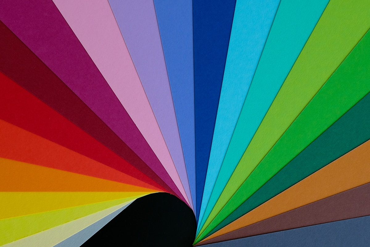
- Red: Often associated with passion, energy, and urgency. It can stimulate appetite and increase heart rates.
- Blue: Represents calmness, trust, and professionalism. It is frequently used in corporate branding.
- Green: Symbolizes nature, growth, and tranquility. It is commonly used in eco-friendly designs.
- Yellow: Evokes feelings of happiness and optimism but can also be overwhelming in large amounts.
- Purple: Associated with luxury, creativity, and spirituality. It is often used in beauty and high-end products.
- Black: Conveys sophistication and elegance but can also represent negativity and mourning.
- White: Symbolizes purity and simplicity. It is often used in minimalist designs.
Cultural Significance of Colors
Colors can have different meanings in different cultures. For example:
- Red: In Western cultures, it often signifies love, while in China, it represents good fortune.
- White: In many Western cultures, it symbolizes purity, but in some Eastern cultures, it is associated with mourning.
- Green: In the Middle East, it is a sacred color, while in some Western contexts, it may represent jealousy.
Understanding these cultural nuances is crucial for global design projects.
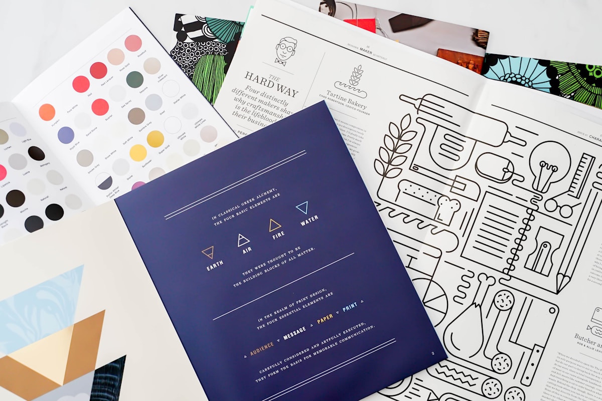
Choosing the Right Color Palette
When working on a design project, selecting the right color palette is essential. Here are some tips for choosing colors effectively:
1. Define Your Brand Identity
Your color choices should reflect your brand’s personality and values. Consider the following:
- What emotions do you want to evoke?
- What message do you want to convey?
- Who is your target audience?
2. Use Color Theory
Familiarize yourself with basic color theory concepts, such as:
- Complementary Colors: Colors opposite each other on the color wheel that create contrast.
- Analogous Colors: Colors next to each other on the color wheel that create harmony.
- Triadic Colors: Three colors evenly spaced on the color wheel that provide balance.
3. Consider Accessibility
Ensure your color choices are accessible to all users, including those with visual impairments. Here are some guidelines:
- Use sufficient contrast between text and background colors.
- Avoid relying solely on color to convey information.
- Test your designs with color-blindness simulators.
Applying Color in Design Projects
Once you’ve chosen your color palette, it’s time to apply it effectively in your design projects. Here are some areas to focus on:
1. Branding
Your brand colors should be consistent across all platforms, including:
- Logos
- Websites
- Social media profiles
- Marketing materials
2. User Interface (UI) Design
In UI design, color can enhance usability and user experience. Consider the following:
- Use colors to guide users’ attention to important buttons or calls to action.
- Employ color coding to categorize information clearly.
- Maintain a cohesive color scheme throughout the interface.
3. Print Design
In print design, color can influence how your audience perceives your message. Keep these tips in mind:
- Choose colors that reflect the tone of your content.
- Be mindful of color reproduction differences between screens and print.
- Consider using spot colors for specific branding needs.
Conclusion
Understanding the importance of color in design is crucial for creating impactful projects. By leveraging color psychology, selecting the right palette, and applying colors effectively, you can enhance your design work and connect with your audience on a deeper level. Remember, the right colors can tell a story, evoke emotions, and ultimately drive action. Embrace the power of color in your design projects and watch your creativity flourish!